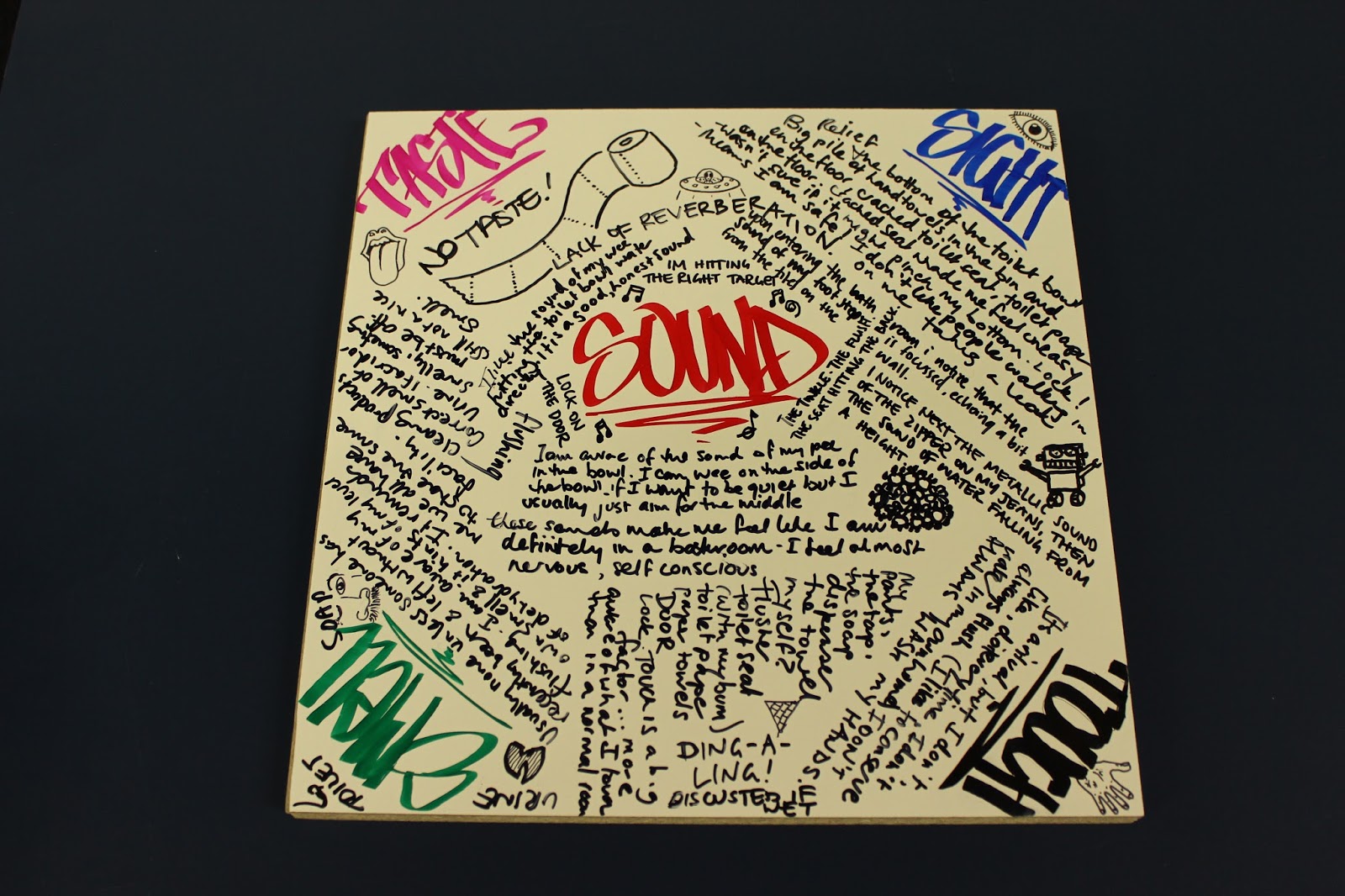
My photo
Sydney, Australia
portfolio | precedents | process [since 2012]

Thursday, October 31, 2013

ccdn 231 project 2 | hand in


Rationale


The sensory/emotional experiment for project two became an elaboration on the topic of using the toilet. The process of working though the first project reinforced the importance of privacy that is a natural part of any enquiry into toilet use. It was clear that it would be more beneficial to introduce a means for further investigating the emotion of the act that was more socially acceptable. Reading material designed specifically for use in the toilet seemed an obvious solution. The result was three experiments in reading material that could alter the mood of the user whilst he or she is engaged in the act of using a toilet.

The first experiment was an exercise in translating the meaning of austerity so that the publication produced to evoke this emotion was devoid of any abstraction and became a literal translation of the word. The suggestion is that all that is required to fulfil the task of a toilet is a singular receptacle, irrespective of its age or state. Hence the rusty bucket suggests the concept of going ‘back to reality’, while the recycled paper further emphasises sustainability and social responsible design (Atfield, 2000).  The absence of text, with the exception of the word itself expresses the minimalism of austerity.

The physical as well as the mental state of comfort is bound up in this pictorial representation of the understanding of comfort resulting from project one. The responses from those interviews contained a clear message regarding the priority the participants granted to security and hygiene while using the toilet.  While comfort has in the past been more closely associated with bereavement and spirituality, these priorities are more in tune with the contemporary understanding of the word. (Shove, 2004) The locked door responds directly to the user’s need for privacy and the fur suggests the comfort of cuddly toys while the whole piece is contained in a Ziploc bag with the words confirming its fresh and clean state being all that are required to suggest comfort to the reader.

The most comprehensive experiment relates to glamour. Just as beauty is in the eye of the beholder, so too is glamour, the judgment of which is at least partly subjective. While it was used to describe sorcery previous to the twentieth century it was to become synonymous with the artifice of American cinema between the 1930s and 1950s (Dyhouse, 2011). The magazine makes use of a familiar magazine format to subtly ridicule the contemporary understanding of Hollywood-style glamour through complete redesign of the inside and outside pages of the cover. The front cover promoting the feature articles as well as the three pages of advertising are exclusively about the use of the toilet. The use of celebrity faces and well-known brands accentuates the appeal of the magazine. The reader will feel glamorous by association.

An interesting by-product of each of the experiments is humour, which may be a reflex action to the subject matter. There is a natural tendency within western cultures to allay discomfort with humour, which might explain this occurrence.

Shove,E.(2004) Comfort, Cleanliness and Convenience: The Social Organisation of Normality. London: Berg
Attfield,  J. (2000) Wild & Things. London: Berg
Dyhouse,C. (2011) Glamour:  Women, History, Feminism. London: Zed Books

Friday, October 25, 2013

dsdn 144 | project 3 hand-in

The push to impose our ideals of beauty and femininity starts at a very young age. I confess I am resigned to letting it happen to my three year old daughter (I even occasionally encourage the invasion of the princesses - maybe because it is nostalgic for me) but it was a graphic and unsettling shock to me when I merged the two images for this photographics project. 'Would you let you daughter go out looking like that?'


© luckiestwomanalive 2013

© luckiestwomanalive 2013


© luckiestwomanalive 2013

© luckiestwomanalive 2013

dsdn 144 | project 2 hand-in

Project 2 started out as an exploration of the growth and development of my three year old. I was going to do a stop motion video of her clothes but when I started to shoot it I was not very inspired and it didn't feel like I was going anywhere with it.

I had some really great images from my infancy that I was interested in incorporating into my design work so after seeing some interesting precedents and discussing my ideas with Matt and Linda I decided to work on a collage process. I was inspired by Ava Seymour and Fra Angelico (see below in presentation)

Touching up the original photos particularly the 3rd birthday one (where many of the objects were very familiar) felt like I was touching objects and people long lost to the past. It felt like a form of time-travel. Hence the name of my project. 

Technically I had a few hitches with my first attempt. I got a bit trigger happy with the blend options in Photoshop, especially on the interior shots. Here are some process images to illustrate my point. It wasn't right and I needed to choose between 'in-your-face' collage technique and 'Photoshopped-to-death' fake snapshots. I then received some helpful feedback from Matt that got me back on track.

© luckiestwomanalive 2013
The most successful image at that stage seemed like the newborn image of me with my dad (and Rory's face placed over mine) but I needed to incorporate an element of something shot specifically for this project so I kept going with my quasi-religious theme and incorporated an outstretched hand. (Which was mine.) Even though I tried to inject humour into my images, this immediately felt a little poignant for me since working with this image made me feel a bit sad about the fact that my dad and Rory will never meet and yet, after a little digital tampering, here was my dad as he held my little girl. I am a self-confessed agnostic and therefore do not identify as a christian but I like the idea of angels and feel like this image expresses the idea that my dad and daughter are MY angels. I stopped short of giving dad a golden Fra Angelico-esque halo though... I am sure that would've been something he would not have been comfortable with.

© luckiestwomanalive 2013
These are the final images I submitted. The presentation that follows contains the original 'vintage' images as well.

© luckiestwomanalive 2013

© luckiestwomanalive 2013


© luckiestwomanalive 2013


© luckiestwomanalive 2013


Wednesday, October 23, 2013

dsdn 144 | process for project 2 (time)

I was really wanting to make a stop motion video but feel like time isn't on my side. I did make something the other day that captured the nostalgic feel I was trying to achieve. It helped me to understand how important it is to me to underline the role of my daughter as a 'muse'in these two projects.


So back to the drawing board...

Friday, October 18, 2013

dsdn 144 | the genius of photography


ccdn 231 | project 3 final presentation

Mission accomplished...


Experience: using a toilet
Related to feeling: comfort
Venue: Toilet located at WIG 052
From previous experiments and my own extensive experience around people using toilets [1] there are several aspects that take priority for most people in order to attain an acceptable level of comfort in this situation. These are privacy, hygiene, ample supply of equipment for personal cleanliness as well as to be aesthetically pleasing and finally, an acceptable odour. Any of these four characteristics can take precedence depending on the circumstances of the event.
For the purposes of this experiment I recognised firstly that for a feeling of comfort to be evoked it would need to be tailored specifically to the person(s) undergoing the experience. Since I feel certain that Sarah Baker and Kath Foster would fall into a similar age category to that of my own, and that culturally I would estimate that there would exist between us a certain level of commonality I decided to use myself as the benchmark for the audience. I have therefore taken the liberty of filling the space with personal items that I find comforting. References to my deceased father play a role in evoking nostalgia. Interestingly a search on the word ‘comfort’ reveals multiple references to bereavement (Shove, 2004). Comfort in this instance therefore comes about by remembering life before the pain of loss.

Privacy: Most people in western cultures would agree that this part of the experience is vital in order to experience comfort. This posed a problem right away since there would be two people participating and it would be impossible to offer privacy if both used the chosen toilet at the same time so I would need to make certain I could guarantee privacy by scheduling each person’s visit and ensuring that the user felt at all times that their privacy was not in question. I have also conducted noise experiments within the room and have found there to be a good amount of sound insulation due in main to the heaviness of the door.
Hygiene: Consideration of the ways in which cleanliness is suggested in public spaces involved removing any obvious marks on the walls, physically cleaning the toilet and sink and ensuring all other surfaces were actually clean using Dettol (the faint odour of which might reinforce the idea of cleanliness). As soon as the standard lamp was installed, the room seemed perceptibly cleaner and the lighting suggested a more homely atmosphere. This might imply that homes that seem clean and organised are cleaner than institutional or public spaces.
Equipment: every item placed in the room had significant meaning to me or was specifically there to further emphasise privacy or hygiene. For example, the portraits were of me and my immediate family, all taken more than a decade ago – the one of my mother was taken in 1958. The buttons were a favourite amusement form my early childhood, the perfumes all favourites of mine as well as one of my mother’s bottles from her youth. The magazines belong to my mother-in-law and have been passed on to me. The main objective was to create an atmosphere of nostalgia and it is surprising how effective a few items of personal significance can be in achieving this. I left the items I had cleaned with the toilet brush and toilet duck to suggest a home toilet. It is very unusual to see items like these in an institutional facility. The music I played was via a Spotify playlist of Burt Bacharach music – I consider this to be the ultimate in comfortable music though not in a negative sense. It is highly palatable background music without being ‘musak’.
Odour:  as discussed I had cleaned the bathroom to ensure its cleanliness and ensure the remnants of cleaning product would instil confidence as to the standard of sanitation.  I also sprayed with a vanilla scented room spray that always reminds me of cupcakes which in turn reminds me of my childhood.
The result: The overall effect was one of homeliness and old-fashioned comfort. It was remarked on by at least one participant that even though there was evident comfort, there was also a sense of glamour which might be because we automatically assume that any obvious care in an institutional facility is immediately associated with places where toilets are glamorous.
I consider the orchestration of the experience to have been a success as there was no confusion as to how the audience perceived the experienced the space.


[1] As previously discussed I founded and was the owner/operator of a business in Australia that catered to for the powder room needs of high-end/high-profile events in Sydney, Melbourne and Brisbane. Started in May 2003 and eventually sold in August 2010, it unintentionally provided me with a means for (informally) researching the habits and behaviour of the general public when attending events in an exceptionally wide variety of situations. It also led to my being acknowledged in the Australian events industry as an ‘expert’ in toilets and evidence of this profile still exists online (e.g. http://www.abc.net.au/catapult/stories/s1530529.htm & http://www.femail.com.au/oh-de-toilette.htm)The current owners’ website is located here: www.ohdetoilette.com.au

Sunday, October 13, 2013

dsdn 144 | hony

Since we are talking photographics...it wouldn't be right not mention this guy.


Humans of New York

Thursday, October 10, 2013

dsdn 144 | precedent

Sherrie Levine - appropriation art

I am quite interested in the work of Sherrie Levine whose work I find quite anarchic. Her work, for example After Walker Evans, (fig. 1)  that focuses on photographing or reproducing existing photographs or sculptures, is so subtle that it's easy to miss the point. (Google Sherrie Levine images and you'll see what I mean). When you realise what the artist is doing, (i.e. rephotographing others work and presenting it as her own) you may be surprised at how you feel next. I was slightly annoyed the first time. I am not often annoyed by contemporary art. But in this case I think it's because it feels like a trap. A practical joke (I don't much care for those either). But there's an excellent piece written about her retrospective held at the Whitney in NYC in 2012 that properly engages with what's at stake here and it sits really nicely with the Time project.


Fig 1. Sherrie Levine: After Walker Evans, 1981 (Evans/Levine)
Don't worry fellow DSDN'ers, I am not going to turn in a project of other great photography shot by me, but it does fit with some ideas I have had about photographing old photos from my childhood or of my elderly mother who I am unable to see very often. Perhaps using a collage method or in a photo album. Interesting.

Tuesday, October 8, 2013

ddsdn 144 | precedent

I am a big fan of Bill Henson. Can't think of a way to apply his techniques to my projects but want to post something as inspiration. I find his work very beautiful and sometimes quite disturbing. My eye seems to always be very pleased by heavy outlines, strong contrasts and the illusion of depth in art. The chiaroscuro technique that is employed by Henson in much of his work helps achieve this effect. Henson also prints his own work and almost always shoots on film because of the depth of tone this produces.

Time Magazine's LightBox series has a nice collection here (definitely click on 'view full screen')

The one I like most from these is:

Source


Saturday, October 5, 2013

dsdn 144 | precedents

Searching for precedents for my projects produced a wild variety of images, here are a couple...

Nick Brandt


Found the following image on Huffington Post and on clicking through found a really powerful series of black and white animal images that really moved me. I find those images and this one (which is from a series he shot at a lake in Africa that has literally calcified these birds) really satisfying. His subject matter and composition seem very controlled and the result is surreal but he must anticipate this reaction as he comments that they were taken and placed just as they had been found and that the intention was to create a 'portrait in death'.

Source

Cindy Sherman


I have always really loved Cindy Sherman's work. Having grown up a part of the Madonna Generation (my term - I have literally grown up and old with her and feel she is one of the most influential identities for women of my age) I can see many similarities between the two women in terms of their output and their public personae. Even though she has made a career out of self portraiture and self-transformation it's almost impossible to know who the real Cindy Sherman is and I feel like the same can be said about Madonna. One-upping oneself is key to the evolution of each artists' work. (i.e. 'You thought that was shocking/amazing/cool - take a look at this') Pop culture and its underbelly feature throughout. It's like a never ending diary of the stuff we notice. Both have produced imagery that is highly staged and manipulates the viewer. I am interested in exploring Sherman's work for my second project. In particular she made a stop motion video in the mid-seventies that depicts her as a paper cut-out doll (see below). Really interesting for me as inspiration for my own stop motion video that would depict the passing of time through Rory and or her clothes and toys...watch his space.  Here is the image that triggered my interest:

Source


Thursday, October 3, 2013

ccdn 231 | 'girls don't poop'

Here's an example of how an advertiser has altered the feeling around a taboo subject (smelly poos) so that it becomes acceptable and humourous. It's gone viral (11 million hits in 23 days).
I would argue that the actress who presents the ad adopts a 'regal' attitude that suggests glamour and this in turn changes the the product into something that might qualify as glamourous... thoughts?

ccdn 231 | proposal for project 2


For this project I will further explore the act of going to the toilet through a magazine/printed publication format.

I will conduct three sensory experiments involving the depiction of the act. I will alter the context in each of the three acts. I will depict the act so that in each case I produce moods of:


Glamour | Austerity | Comfort


I will choose one of these experiments and in a written rational I will justify the changes I have made by relating my practices to wider social and cultural 'structures of feeling'.

These are the slides I have produced to illustrate my proposal.*
I wanted to give the viewers a sense of how my publications would appear and feel.


Austerity

Comfort

Glamour

I will present my sensory experiments to the class. The presentation will include 2 images from each experiment and a summary of my rationale. The presentation will be no longer than 5 minutes. I will then hand in my presentation slides and 500 word justifying and relating one sensory/emotional experiment to a wider social and cultural ‘structure of feeling’ to the R:Drive.
* I was unable to present this due to illness.

Friday, September 27, 2013

Thursday, September 26, 2013

ccdn 231 | presentation of proposal for project 3

             Presentation of Proposal: Thursday 26th September

A presentation explaining the experience I intend to create. The presentation includes written visualisations of the design/experience.


Tuesday, August 27, 2013

dsdn 144 | time experiment

Just trying out the illusion of time moving with two images that I have placed in layers - the top one at 60%.
It is interesting the way it shows my group of friends both engaging with the camera then not.

I decided to post it because I like the end result.


©2013 Helen K Williams

Friday, August 23, 2013

dsdn 144 | practice composite image + weekly task


I used this shoot to experiment with the ideas used in the blog post here.
I used image No. 1325 (time: 5:38 p.m.), No. 1327 (time: 5:45 p.m.), No. 1329 (time: 5:54 p.m.) and No. 1331 (time: 6:08 p.m.) to make a composite image using the marquee tool and layers in Photoshop. It took 20 minutes to shoot this image. Exposure: 1/64 sec;   f/5.6;   ISO 200.

©2013 Helen K Williams
In order to work on my weekly task, I also shot this image from a similar place in my kitchen at 5:29 a.m. That's the moon in the sky. It would otherwise be dark looking out over the water at this time. The moon was extraordinarily bright that night. The little light in the middle is a lighthouse that is situated on the South Island. I used a tripod. Exposure: 20.0 sec;   f/5.6;   ISO 200.

©2013 Helen K Williams
I also experimented with using an ultra fast shutter speed and here are the results:

The below image was taken at night at a 1/4000 shutter speed. I wanted to capture the movement of the water as I scrubbed the bowl. The result was very 'noisy' as I didn't have enough light. I decided to try again the next day. Exposure: 1/4000 sec;   f/2.8;   ISO 6400
©2013 Helen K Williams

The image below was taken outside on a brilliant sunny day (also with a 1/4000 shutter speed) ...I may have overcompensated with the light this time but I still managed to capture a good 'moment' in time. The white balance needed to be corrected a bit in Photoshop. Exposure: 1/4000 sec;   f/4.5;   ISO 1600

©2013 Helen K Williams


Sunday, August 18, 2013

dsdn 144 | precedents - time

I have started looking for photographers who have used composite imagery to convey the passage of time. The first I have found is Fong Qi Wei.

His series, Time is a Dimension, explores the idea of time being split into fractions and the difference between each fraction is represented by the intensity and colour of light present at the time of the image being taken. His work results in single composites 'made from sequences that span 2-4 hours, mostly of sunrises and sunsets'. (Wei, 2013)
Source
This is interesting to me as inspiration for my project. Can I use clothing to achieve the same effect as the 'slices' of sky? Even though it could be perceived as a literal translation of the passage of time, I like that the artist is using this method to push the boundaries of his ideas.
I also like the collage effect which relates to my intention of making my project look arts and crafty.


Wei, F. Q. (2013). Time is a Dimension
Retrieved from http://fqwimages.com/time-dimension/


dsdn 144 - inspiration

Saturday, August 17, 2013

dsdn 144 | project 2 - proposal


For this project I will express the passage of time via photography by taking a series of images of my young daughter’s clothes from birth to present day (she is now almost 3 and half). 

I will present the work using time lapse photography with the items of clothing placed using a technique similar to stop motion animation. I want to show how emotional these inanimate objects can be when photographed in this context.

I will use a simple background and one light source. From past projects I know how important it is to keep the lighting consistent so I will probably shoot in my garage. I want it to feel like a craft project – there needs to be a sense of homeliness.


I am interested in exploring the use of the Premiere Pro/ After Effects plug-in Twixtor to move through the changes of clothes in a really smooth, slow-motion way. I am interested in building on my Premiere Pro skills which I have recently been using to do an assignment for one of my second year papers.

As part of the process I will put together a short clip of images showing my little girls's face undergoing the transformation from new-born to young child. This will accompany my final hand-in.


dsdn 144 | my own work


I have been mucking around a bit with my new camera and have two images that I haven't been able to get out of my mind.

The first is the very first photo I took with my new camera. I feel like this banana is lurking in the shadows. Like it's capable of murder. I really like the light reflecting on the top. (Shining in a way that a banana really shouldn't).

I shot it with a macro lens on our kitchen bench at night.

©2013 Helen K Williams
The other is this one that I almost deleted as it was part of a series I shot for the stop-motion exercise. When I went back to look at this, the first shot of the series, I was almost regretful I hadn't used stairs as a subject for Space (project one).

I like the play of the shadows on the stairs. The backpack off to the left (descending the next set of stairs). The different textures. How linear/geometrical the image is.

©2013 Helen K Williams
I decided to add a black and white layer in Photoshop. Just to contrast the two. I prefer the colour one. The B & W seems a little dull.

©2013 Helen K Williams

Friday, August 16, 2013

dsdn 144 | weekly assignment... stop motion

Somthing went wrong with my images of Cuba Street yesterday so I shot some images on the train this morning and have used Photoshop (in the absence of Premiere Pro at the school) to animate it...


Paremata - with 0.2 sec delay - I feel like this is the more successful speed

Thursday, August 15, 2013

ccdn 231 | project 1 hand in

toilets

I decided to investigate further the act of going to the toilet. I have made a documentary-style video that depicts five people in the act of going to the toilet. Each individual clip represents one of the five senses. (i.e. five people, five senses). The clues are in the words which are overlaid as 'handwritten' script - taken from their written responses to my interview questions.

None of the clips involved nudity and the identity of each participant was deliberately obscured. One of the greater challenges was therefore to maintain the viewer's interest in the final edited version of the combined clips.

I did this through interesting angles, starting the crawling text at a moment where the viewer might be needing new stimuli and also when the sound of urinating commenced (so as to distract from any discomfort the viewer might be feeling).

The act of making and showing this video has almost become more important than the investigation of the actual activity. Finding willing participants was a little difficult at first but once they had seen how it was to be handled I was able to convince five people to take part.

The process was two part - firstly I asked each person to be filmed in the act of going to the toilet in a variety of locations. I then asked them to answer three questions for each of the five senses. I used this material as content for the crawling text in each of the scenes. I took the best responses for each sense and added it to the scene of the person responsible for writing it. So the words that scrawl across the screen in each room are the words of the person being filmed.

I then took the remaining material and used it for my physical hand-in. This was a piece of toilet wall covered in 'graffiti' about each of the five senses. I have therefore fulfilled the brief requirement of 500 words by submitting about 200 words in the video and the remainder of the 500 on the 'graffitti wall.

For my wall I was inspired by the cubicle on level one at the Vivian Street campus.

Here is my physical submission:

Front

I decided to use a mix of words and drawings to illustrate my board. The coloured words in 'tag' style (which are the headings for the five senses) and the 'tag' lettering is by Nikolai Scott.

And here is my video:


Note: For a short time, my video is watchable on this blog. After 31 August 2013 it will go 'Private'.


Thursday, August 8, 2013

dsdn 144 | panorama

I have recently acquired an app on my iPhone called 360 which produces really amazing 'flat' panoramas as well as giving you the ability to view a space in the round via the web-sharing platform.

Here are a couple of flat ones:

©2013 Helen K Williams

©2013 Helen K Williams


Here is my panorama using Photoshop and the 'place' command...

©2013 Helen K Williams


dsdn 144 | final hand in

Here is my presentation and the series of four images I chose to hand in.


©2013 Helen K Williams

©2013 Helen K Williams

©2013 Helen K Williams

©2013 Helen K Williams


Evaluation


 In undertaking the first project for photographics I have, first and foremost, acquired my own digital SLR camera so I have been afforded the luxury of being able to use my own equipment and start really learning how to use the camera.

My first efforts also made me remember how difficult it is to photograph a small and enclosed space in a way that is new and/or interesting. This was always the challenge for me when I owned my business and nothing has really changed. Previously I nearly always resorted to photographing tightly composed images because of this difficulty and by returning to the challenge of focusing on the space aspect rather than the object I have had to confront that issue.

I am satisfied that I have concentrated on portraying the space I was shooting better although there were many unsuccessful attempts as evidenced in my contact sheets.

I found an interesting narrative in choosing the space around the basin to create my theme. I would like to develop that more in my own time. It would make an interesting study as it reveals information about the personality of the owners of the sinks such as their sense of order and need for abundance. There is a psychological study awaiting further exploration in this area.

I tried to shoot at different times of the day and in natural as well as synthetic light and while I had a few issues with white balance settings (and failing to think about that) I was able to produce some interesting final images that required minimal to no further intervention in the way of Photoshop.

One important thing I feel I learnt was to look at all the space in the frame of the image before shooting. I found myself becoming much more conscious of this and it helped improve the quality of my work.

Monday, August 5, 2013

dsdn 144 | fifth shoot

I am finding the older bathrooms more interesting. The best part is that even though I am finding the resulting images much less clean, the idea of glamour and purposeful order is still there. The faux marble in particular is really pleasing to me.

This bathroom is about to be renovated and I have thinking about it including it all along so I managed to get these just in time. I love the faded seventies glamour of this bathroom. It is always very nostalgic for me to enter this space. For some reasons I have always liked its extra long bench top too. I am excited to see the new bathroom but will miss this time machine.


©2013 Helen K Williams

Sunday, August 4, 2013

dsdn 144 | fourth shoot

By now I was keen to photograph some older style bathrooms with a little more history and patina.
There were two bathrooms in this house - I ended up using one of the guest bathroom in my final series of four which is the only one in my series without a mirror behind but I was intrigued by how still this space was (which is exactly how this house feels whenever I visit it) and thought it had a place among the others. It also evokes a powerful feeling of times past for me. The soap on the dish looks as though it may have been there for years. I still experimented a little with my idea of depicting forgotten space but have shelved it for later.


©2013 Helen K Williams

dsdn 144 | third shoot

I asked my friends who own a house overlooking the water if I could shoot their bathroom. I specifically asked them to leave the bathroom untouched - no last minute tidying - so that I could capture their personal touches. It was hard not to feature the view in the shots. But in the end I realised I was heading down a different path with my subject matter and composition so unfortunately the views were wasted for this project... it might be nice to revisit this in the future. Here are the contacts:


The most successful from this shoot in terms of my more narrowed down requirements is this one but I was disappointed with this shoot because i couldn't seem to get the shot I wanted. I do like the little bit of toothpaste in the top right of the basin though.

©2013 Helen K Williams


Saturday, August 3, 2013

dsdn 144 | second shoot

Next shoot is at home. I had to fix my white balance after the first 14 images and then it was OK. I am really liking playing with the reflection in the mirror. It appeals to my sense of order and symmetry. I am exploring the space around the basin since each of these spaces in our house is reflective of its user.


Of these images, the following are most most successful at expressing the cleaner, more cared for personal spaces I have been wanting to portray. 

©2013 Helen K Williams

©2013 Helen K Williams

©2013 Helen K Williams

©2013 Helen K Williams