My photo
Sydney, Australia
portfolio | precedents | process [since 2012]

Sunday, April 28, 2013

dsdn 101 | pattern

Here is my initial pattern design. It incorporates the style of aboriginal art and the colour palette of the social media icons. It expresses busy-ness and order - two of my most outwardly obvious personality traits. On another level it speaks about communication lines and networks and visually defines my understanding of the way that social media works - that is, snippets of information coming together to form a complex pattern. Delving deeper again, it reveals the interconnectiveness of the world we live in and how we are all related in some way to each other.

©2013 helenkwilliams
Here's how it would look in a repeating pattern:

©2013 helenkwilliams

Saturday, April 27, 2013

DSDN 101 | colour palette


I have grouped together six social media icons that represent my social media world online
twitter, youtube, facebook, pinterest, blogger, RSS feeds (for blogs)

And used them to create a palette on kula for my pattern...

Social Media Icons palette
Then added it to my palettes on Illustrator:

Swatch added
Now to experiment with my pattern...

Friday, April 26, 2013

dsdn 101 | precedents

Source


Central and Western Desert art - Australia.

I have chosen to study this particular region's aboriginal art because I can see a correlation between social media icons and the symbols those artists use to represent important places. In addition, the lines that represent journeys or pathways between these locations can be interpreted as communication lines. The dot painting method used by Western Desert artists has always really appealed to my keen sense of order and this project will give me an opportunity to adapt these patterns for use in my animation.

'The works feature a symbolic language of U shapes, concentric circles, journey lines and bird and animal tracks. Artists used a limited number of motifs to express many meanings. A concentric circle, for example, may indicate a camp, a waterhole or corroboree place. It may also represent all or part of a person, the stem of a tree, the centre of a food plant ancestor or a natural feature such as a hill'.
(National Museum Australia, 2013)

National Museum Australia. (2013, April 26). Retrieved April 26, 2013, from http://www.nma.gov.au/collections/highlights/papunya-collection

dsdn 101 | flash test

Here are my initials in Flash. I wrote them in Vectors - imported them to Flash and used ‘motion tween’ to create a ...seven second clip of the letters moving around the page. This is a very scaled down version of an idea I'd like to use in my final flash video.


DSDN 101 Project 2 Flash Test from luckiest_woman_alive on Vimeo.
©2013 helenkwilliams

Saturday, April 20, 2013

inspiration | cupcake pavilion

Designed by design collective Oh.No.Sumo. for Auckland Architecture Week 2012, it reminds me of one of my ideas for Project 2 in DSDN 104 last year...


dsdn 101 | process work

Viewfinder sketches
 Logos... I have decided to concentrate on looking at my clothes and patterns in the fabric which individualise my self. Also clothes represent my history and the fabric's patterns often invoke strong memories.

©2013 helenkwilliams

©2013 helenkwilliams

Friday, April 19, 2013

dsdn 101 | process work

Have started work on my pattern design in illustrator

I have this development of sketches:  
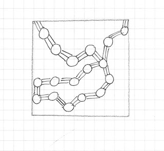
1. initial idea

Here I broke the first design down to one single component then abstracted it slightly

Then riffed on the idea and decided to procede with the sketch at the bottom of the above page

So that is how I arrived at the initial pattern - I intend on recreating this design in Illustrator then further developing the idea.

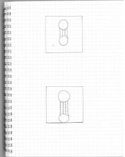
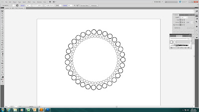
And this is the process I used to recreate my final pattern. I needed arrange the circles so as to form a circle. Here are the steps I followed (using a modified version of these instructions):

1. Select a single instance of the circle I wanted to distribute along the path
2. Used the brushes palette (F5)
3. Dragged and dropped the shape onto the brushes palette.
4. In the New Brush dialog selected "New Scatter Brush" and clicked OK.
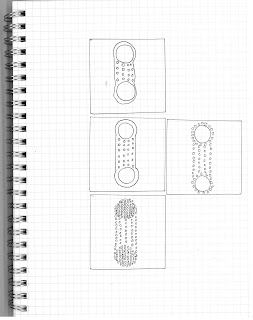
5. Selected the path (a 90mm circle) I wanted to distribute the shapes along, and then set
the stroke to be the new brush I created.
6. Initially the shapes were too closely packed along
the path. I edited this by double clicking on the new brush pattern and modifying the spacing value to 111%
7. Note for future: If I want I can convert the shapes used in the brush stroke into standalone shapes by highlighting the path and selecting "Expand Appearance" from the Object menu. If I ungroup the resulting shape I can manipulate the individual shapes separately.


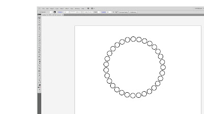
1. arrange the circle object on a circle/curved line
2. repeat process with progressively smaller concentric (path) circles and slighter smaller objects
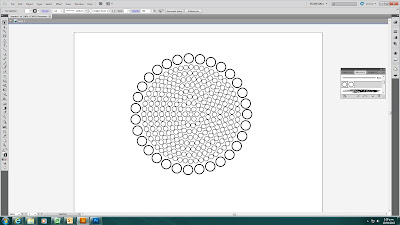
3. having started with a 9mm circle each smaller circle was 1 cm smaller in diameter
 
4. Now I just have to copy and paste the design at the lower end of the artboard
I also have to make sure the designs are placed centrally. I use the align central option in the align palette.

Then I use the same method to place the vertical lines between the two circle designs.

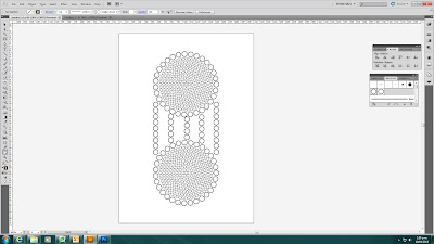
5. I have something that resembles the original sketch


Tuesday, April 16, 2013

dsdn 101 | studio 11

Today we did the tartan making excercise. Here are my results. (I did one based on the colours of New Zealand and one inspired by the colours of Australia).

New Zealand

Australia

Monday, April 15, 2013

dsdn1 101 | project 2 brief

I have gathered together some symbols from one of my ethnic cultures (earthy colours of bark paintings) and combined them with a small animation I saw the other day on tumbler:


Here is the resulting tile. Note the overlapping circles... I wanted to express the randomness of some of these connections.

©2013 helenkwilliams
And here is the pattern:

©2013 helenkwilliams

My brief:


In my project I will identify the cultures, both ethnic and urban that have shaped the person that I am.


There are a variety of ethnic cultural influences that contribute to this – I have lived in Australia, New Zealand, France, the United Kingdom, the United States and South Africa and the result of this nomadic existence is a ‘mash-up’ of cultures that I readily relate to and identify with. I am going to focus in particular on the Australian Aboriginal culture in this mash-up because I am able to draw comparisons between that nomadic way of living and my own own itinerant lifestyle. Even though we know there is aboriginal heritage on both sides of my family, there is no formal information about this so I have always been unsure of my background. I believe I have readily adopted other cultures throughout my travels because the history of my own cultural heritage is so enigmatic. My project will identify and express this similarity.


I have also identified within my urban culture a strong influence of and affinity to social media which I have used to support and maintain both my personal and business lives. My personal taste in music, entertainment and politics as well as my traveller life have been well documented by sites like Facebook as well as providing a means for connecting with old friends as I've shifted about so for me there is almost a symbiotic relationship between the two. My project will show how intrinsic networking and therefore social media is to my life as well as the potential it has for consuming my reality.


I will research precedents of aboriginal art for representing my abstract forms and will further abstract those to find a personal take on my ideas.


My personal way of moving is usually high paced, driven and sometimes manic. I will use these traits to characterise my work.

dsdn 111 | process work/today

Feed me a crumb... anything.

Sunday, April 14, 2013

dsdn 111 | homework

While I have been thinking off ways to express the build-up and release of energy required for each stroke of swimming, it occurred to me there is an exchange of this pattern between the left and right side of the body - best illustrated with my diagram below:

Source

I now feel like I have something meaningful to abstract from.

Thursday, April 11, 2013

dsdn 111 | today's studio process work

Bearing in mind we have much less time to complete this project, I forged ahead with sketching and after reviewing my images and quick sketches from the last studio:


I most liked the ideas around the swim stroke
So I started sketching more ideas around the swim stroke
From this work I confirmed my words:


build-up (and) release (of) energy

 I then worked on the idea of making one simple figure that expresses build-up and release.
I drew this
Then I tried to recreate this in the paper I had bought for the project but found the paper loose and it would not do what wanted, so I think it will be Rino plastic for me.

first iteration...?
 Incidentally here is an image (found here) taken by my friend Neale who is attending the Salone del Mobile 2013 - he credits it as being by Poliform though I could not find any more info about it so I will have to wait to till I hear from him to found out some details (like who the designer is etc). Isn't this all about fluid form?


dsdn 101 | post-drawing-exercise-inspiration

I enjoyed project 1 so much. It is the first time I have 'had to' draw for any reason for ... well decades.
I found this cool blog post today and thought I should put it away for when I am deadline free and looking for more drawing goodness...

Link

dsdn 171 - project 2


Wednesday, April 10, 2013

Tuesday, April 9, 2013

dsdn 101 | project 1 hand-in


EX 1. IDENTITY 

I chose to group together my five objectives in a hierarchical composition. Originally I was going to use my ring as the fifth item (as seen here) but in the end I chose to replace it with a USB stick. I was pleased with the outcome of this piece and quickly realised I have a strong preference for working in ink. I appreciate strong lines and clearly defined objects. I also like the cartoon-like aspect to this medium.


Identity - final. ©2013 helenkwilliams

EX 2. HATCH
 
I continued to explore the surfaces and patterns evident in four of my five objects in my hatch exercise. I decided to layout the twenty-four sketches according to the hierarchy of exercise one. I tried to increase the density of each row so as to fulfill the brief's requirement of a discernible gradient. (Interestingly, it ended up being readable from top to bottom and well as from side to side.
I excluded the USB stick from this stage since it will be the focus of the next four exercises. 
I started with a motif or single example of some aspect of each of my personal items and then imagined how each would look as the viewer backs away. I enjoyed this exercise and almost found it therapeutic. (Although some of the hatching in the far right squares was a test of my patience). I used a full spectrum of pen thicknesses (from 0.05 to 0.8). I am particularly satisfied with some of the leaf row (third down).

Hatch [final] ©2013 helenkwilliams

EX 3. ANALYSE/DRAW 

Analyse/Draw - [final] ©2013 helenkwilliams
I commenced my analysis of the USB stick with drawings of the exterior and then imagined the contents (with the help of a little research online) which I drew mostly with a hatching technique.


EX 4. SECTION/SCALE 

For this exercise I took the USB stick section from the last exercise and used semi-transparent paper to add layers of new information to the diagram. Inspired by USB circuit board diagrams (found here), I embellished and repeated patterns used in the earlier section  as well as references to my hatching.  I find the mood for this sketch very industrial and urban so it felt fitting to finalise the sketch with a city scape constructed of USB's erected along the 'top' of the section.

Section/Scale - [final] ©2013 helenkwilliams


By way of explanation, these are the three layers that make up my final sketch:

Section/Scale - three layers ©2013 helenkwilliams


EX 5. IN THE STYLE OF...

The style of drawing was derived from a piece originally drawn for online design magazine ‘Core 77’ by Chicago designer and art director Craighton Berman. It also features on Berman's drawing blog here

Original. Source


Craighton typically uses a naive, cartoon-like style which is deceptively simple and fun to look at. To answer the brief, I emulated his simple composition, quirky ink-pen style and clean layout, all of which are signature features of this designer’s drawing. In this particular sketch I also drew inspiration from his use of primary colours and tried to use a similar sense of humour in my text. I felt very comfortable in this style as there are already elements of it that I try to use in my own drawing.


In the style of... [final] ©2013 helenkwilliams


EX 6. FINAL PATTERN 

Using the procedure trialled here I have made a tile using the USB stick again as my hero.

I used a complementary colour scheme as confirmed at kula.adobe.com. I originally wanted a more pale aqua but was unable to buy it in the Promarkers as they were sold out. I checked and this darker hue is still acceptable. It is very Christmassy!


kula.adobe.com - screen grab


This is the tile:
Final pattern tile [final] ©2013 helenkwilliams


Final pattern [final] ©2013 helenkwilliams


EX 7. CONTACT SHEET OF ‘WINDOW VIEWS”

I started out drawing views of all the electronic controls, phones etc we around the home and then started focusing on interesting views of the buttons and controls. To keep a sense of unity among the nine I selected, I have drawn all of the items on the blue carpet in our home. My love affair with the ink pen continues...

Window views [final] ©2013 helenkwilliams


Monday, April 8, 2013

dsdn 111 | introduction to project 2

4 Precedents
Had our first studio for the new project regarding Fluid Form.

Researched precedents and came up with the above.

Started abstracting ideas and sketching them. Worked on ideas for the planet images and the swimmer image:

Studio sketches


For example the amount of drag/force underwater versus above water.
Or the increased distance between the sun and the planets represented as a fan-like object.


Thursday, April 4, 2013

dsdn 111 | hand-in

Planar (Card) Form


Line (Wire) Form


Mass (Foam) Form

All three forms


Presentation drawing: three forms combined in (side) orthographic view

Final summary: 


In this assignment, I think I have had varying levels of success in expressing my intentions in the three forms I have created.

The first form (card) was useful in kick-starting the design process and even though I do not think it was the most resolved form, the heavy line of its 'spine' inspired the development of my ideas for the shape of the second form, the wire form. This form became a metaphor for my chosen word (focus) as well as informing the overall concept for the second form.

Working on the second stage of the assignment culminated in an 'a-ha' moment in the design process. Because it required me to create three forms, each of which are necessarily created sequentially,  this assignment forced me to move past what proved to be a difficult early phase and I was eventually able to produce a form that met my design objective; to entirely convey the sense of the word 'focus’ without resorting to a literal interpretation. Consequently, I have come to better understand a crucial difference between art and design (or perhaps more accurately ‘happy accident vs. intentional result’). I have best summarised the principles I applied to this part of my work here

The final (foam) form came easier to me, allowing me to further abstract my focal idea using the previous stage, even though time constraints left me with a piece that I know I could have crafted better.

Ultimately, my enthusiasm for this project grew as I worked until I achieved a successful outcome and this impetus has fuelled my motivation for working on the next assignment and for the degree as a whole.


Wednesday, April 3, 2013

dsdn 111 | line (wire) form - two more iterations

The eighth and ninth iterations came about after coming into the studio and talking to Nan.

I knew my wire form was unresolved and a routine question about the slightly rounded corners on the form ended with a new perspective on my whole project. The word I was looking to represent is

focus

which the card form had already illustrated exactly. I talked through a few adjustments and half an hour later I had produced this form which I felt was the most successful version so far.

eighth iteration


If I wanted to further the concept of my form containing or defining the space, the process was better served with the use of alternating 'ribs' which interlocked. I sketched a diagram to represent my idea:

alternating rib idea sketched up

Even though these changes resulted in an asymmetrical form, it is still balanced and unified. The form looks wholly deliberate now especially with the addition of the one line of black thread which allowed me to reincorporate the spine idea and really emphasise the idea of 'focus' by drawing the viewer's eye down the line of thread to the focal point or focus of the object.The repetition of the rib forms strengthen and unify the form. The implied tension of the thread (even though it is not load bearing) seems to pull the piece together and ultimately define the interior space.

Ninth iteration: Focus
The word 'focus' better encapsulates my original ideas around the tiled bathroom image too as it is more positive than 'cornered or 'trapped' yet bears some relation to those ideas.

This form is the most successful of the three I produced for the project. There are clear design principles used to support my intentions. It is asymmetrically balanced, (it sits really comfortably contrary to the lopsided shape), it uses repetition (in the 'ribs') and tension (with the thread).