My photo
Sydney, Australia
portfolio | precedents | process [since 2012]

Labels

Showing posts with label process. Show all posts

Monday, June 1, 2015

ccdn 371 | process - found the answer

I am going to use the velum and card to make a non standard book - half way between a A3 and 4 size it comes out like this:


And then I am using thin tape to attach the velum printed with the best of my monthly reads.


I will make a cloth covered book to house the 12 (monthly) signatures. I have researched the methods used to really finish the book to a high standard.

Source


Now I need to experiment with my pages. I thought hard about the concertina but decided it would be too hard to achieve a great finish at the spine without some kind of previous experience.


So I purchased some of the materials and started to experiment


This was too obvious


But I like the page being attached to edge of the linen card (which I really love)


So I think there is a solution here - to use the linen card as the outer layer of the signature


And yes - here is is. The A3 linen card can be folded off-centre and the A4 printed page is attached with the narrow double-sided tape:


So now I need to fold them all:


And then cut the card cover (which will be covered in fabric)


So that the linen card signatures can be bound inside:


For all this, my bone scoring/folding tool has been indispensable - sixteen years after I bought it...


Here the cover of the signature takes shape - note that this is a proto-type and did not end up being used.


I wanted to embroider the word keep on it to retain something of my previous work. I tried multiple options like this:


I transferred the word 'keep' onto the fabric the old-fashioned way - with pencil and tracing paper.


Now the cloth will be glued to the card cover (with Mod Podge - I ended up having to buy the matte version when the glossy Mod Podge proved to streak too much)


Then came the binding - I had 12 signatures which were numbered so as not to mis-order them - too bad that idea didn't work. I still managed to sew them together the wrong way. Undid it and sewed it again.


Looked at all options for the thread - the red thread I bought was too thick. So I looked at organic thread, but it seemed too thin (which risks ripping the paper):


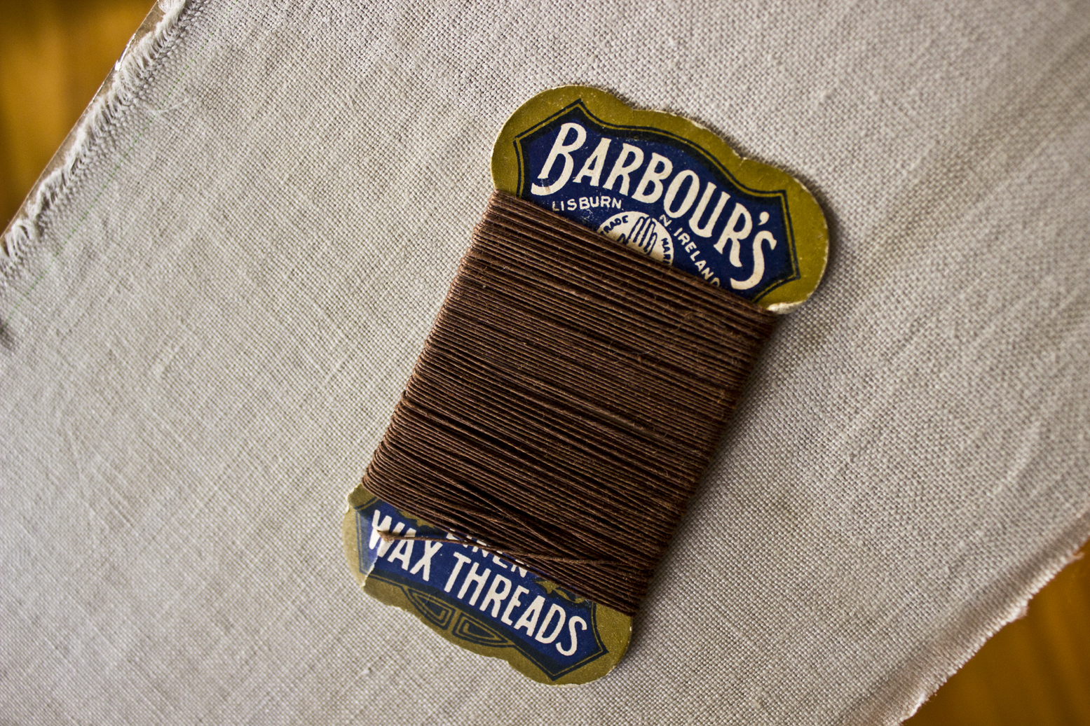
The solution was Grandma Davis' wax thread - perfect for book binding. REALLY old. I was pretty happy I could use it for this project.

I then made sure it was all square and marked where the thread would go:


Here is where the linen tape gets sewn in to the book binding:


The tutorial where I found out how to bind a book is here. 

Here you can see where I have attached the mull cloth to the spine (with a tonne of tacky glue):


Here I am trying out options for the inner paper to line cover and disguise where the glued bits are:

Green

Black
This is what the card would hide. I ended up going for the linen card that houses the signatures.

A full post on how it turned out will follow.


Tuesday, November 25, 2014

DSDN 142 | Project One | Randomness

I like this word word randomness. That we use it in coding is a little bit fun.

So my efforts at randomness include colour and composition as per the learning modules.

Random Grayscale

Random colour (using palette from here)

Random lines

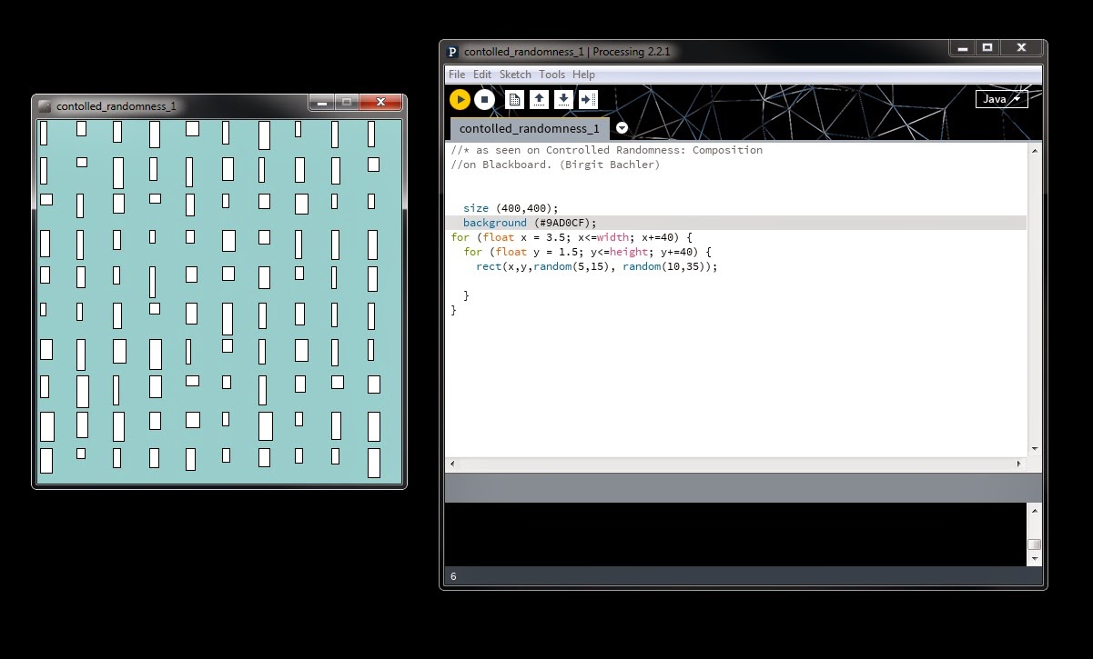
Random boxes

More random boxes with colour background

start of finding solution to one of my nine sketches - lines_grid


Monday, November 24, 2014

DSDN 142 | Project One | Inserting yourself into the code


In 2014, I have been investigating the number of key ideas in my design work and one of them is the idea of being constantly online. I have investigated this in my Photographics paper (CCDN244) and specifically I have referred to the idea of eInk and the possibilities for its application in the form of tattoos. This led me to develop a series of self portraits that can be seen on my design blog here.
As further development of that idea I am interested in investigating the possibility of inserting myself into my code designs. I have based my research on this concept.

Precedent one: Bridget Reilly
The connection between Bridget Reilly and assignment one is obvious. She was the first artist I was reminded of when I commenced this paper and then she appeared in Doug Easterly’s lecture as a precedent. The image that can be seen at the above link is an example of the numerous portraits that can be found of Bridget Reilly surrounded by her art. It is a literal expression of the founding concept for my project. I am also interested in her use of triangulation.

Source


Precedent two: Peter Trevelyan

Last week I visited the Dowse Gallery in Lower Hutt and saw an exhibition that featured this New Zealand artist.  The work featured in this exhibition immediately reminded me of the geometry inherent in the practice of creative coding. It is a pyramid constructed of hundreds of clear plastic set squares. The way in which the light that passes through the sculpture then plays on the surrounding walls motivates me to explore how this can be expressed in code. The triangulation of this form also inspires me to seek a way to recreate some aspect of the form in one or more of my designs. The image to left was taken by me as permitted at the Dowse.

 The Technical Drawing, Peter Trevelyan, 2014, set squares, super glue, Dowse Gallery, Lower Hutt

Precedent three: MIT Media Lab Identity by TheGreeneyl
http://www.thegreeneyl.com/mit-media-lab-identity-1

This is not really by an artist however I saw this in one of the tutorials and was moved to research TheGreeneyl’s logo design project for MIT. I like the way the three simple shapes represent a single person’s contribution then come together to form a new shape. I am excited by the fact that this was programmed on Processing. There is a succinct video that explains the project on Vimeo here: https://vimeo.com/20488585


Precedent four: The art of Scott Blake
Scott Blake is an Omaha, Nebraska artist who makes art with barcodes and QR Codes. There is a multitude of examples of his work that can be seen at his website via the above link and they are really appealing however the reason I am most interested in his ideas is because they further engage with my concept of inserting oneself into the code. The essence of this work is that there is quite literally an underlying message in all his images. For example, his portrait of the American broadcast journalist, Amy Goodman, is made with 2,304 QR codes that link to nine years of Democracy Now videos. (Goodman hosts Democracy Now’s daily news broadcast). The portrait can be seen here:
 https://www.flickr.com/photos/scott_blake/5185387455/in/photostream/


NB - there are some other really interesting examples of QR code art here 


Precedent five: The art of Kazimir Malevich

I have been studying Twentieth Century art this year in my BA which meant revisiting Malevich’s art. He was the founder of the Russian Suprematist movement which grew out of the Cubist and Futurist movements in the early decades of the 1900’s. Works such as Black Square tested the boundaries of people’s perception of art in their simplicity. I enjoy art that is (sometimes deceptively) simple on first viewing and to me Malevich was a great practitioner of this form of artistic expression. Malevich was also interested in aerial photography which led him to abstractions based on aerial landscape which relates to my other current interests: drone photography and data representation. I like the idea of coding an image that recreates a crowded beach as seen from a drone or documents the movement of someone or something. 
An early example of this can be seen below in the photography of Étienne-Jules Marey.

Source


As a addendum to the inclusion of this final precedent, I found an interesting blog post here which talks about the coding world's obsession with simplicity. It specifically refers to the good/bad dichotomy (where good = simple and bad = complex) that exists in coding. I must admit to being susceptible to this mindset already. With relatively little experience in this discipline I have already started forming the opinion that minimal coding must be a sign of greater skill. The above post has challenged me to think alternatively and so I will try to remain open-minded about simplicity in coding for now. 

Sunday, November 23, 2014

DSDN 142 | Hello Processing! | Tutorial

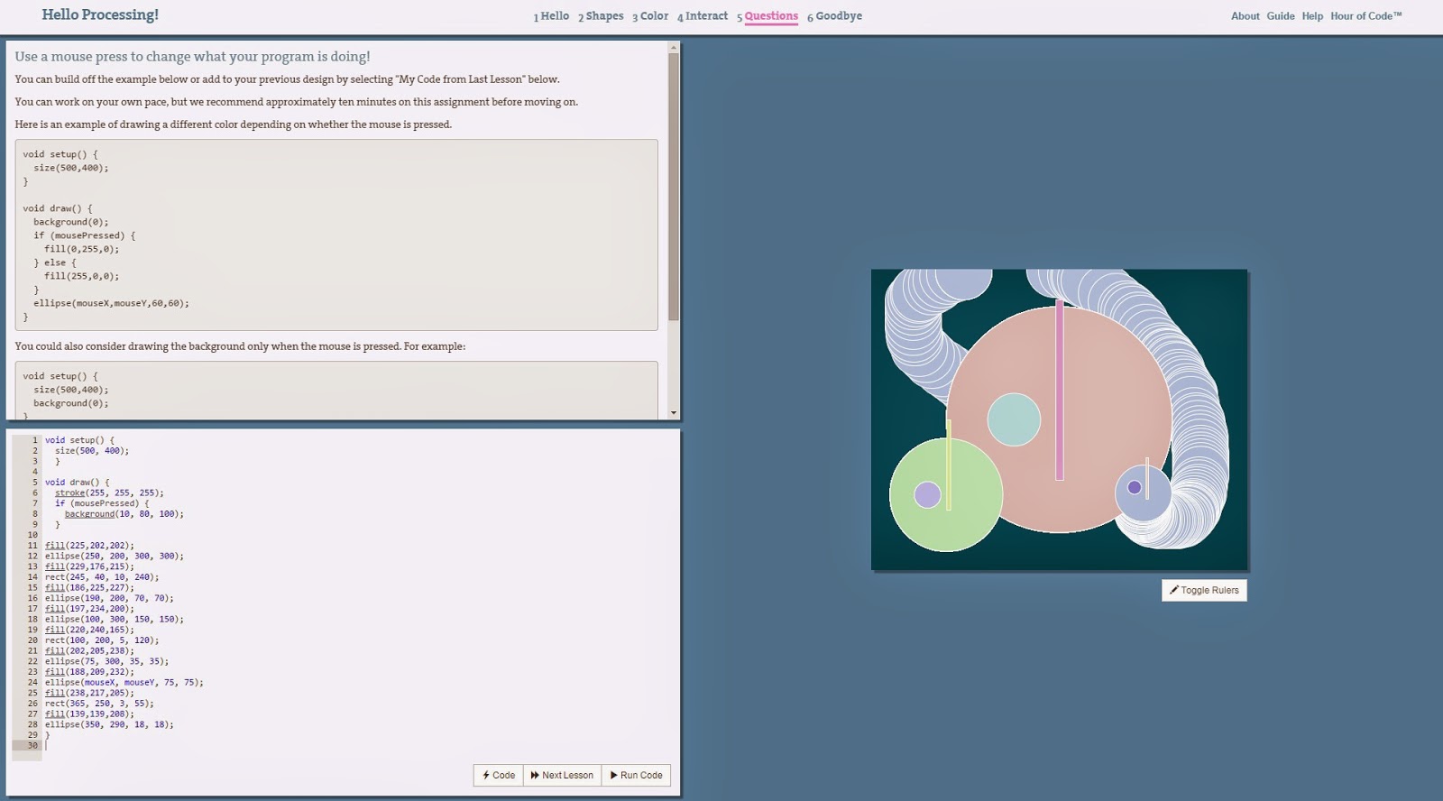
I have done the hour of code tutorial - which by now is slightly basic but good for revising my progress.


First exercise - quick design drawing ellipses and rectangles
Add colour to the design

Animate the design with mouseX and mouseY

Conditional syntax introduced

Done
See the tutorial here.

Sunday, September 28, 2014

ccdn 331 | project four | first draft of manifesto

It's All Two-Way

1. I do no harm – my take on one of the fundamental principals taught to healthcare students throughout the world: “Primum non nocere” (First, do no harm) I will always consider the consequences of my designs and avoid causing more harm than good;

2. I look at things from more than one perspective (RAP 2) – the flâneur concept helped me to remember how important this is. Context is everything;

3. I make with love – AKA passion, care, attention to detail. You can tell when something has been made with love. It looks better;

4. I do not buy into stereotypes (RAP 4) - I question any prejudices I may have that may cloud my judgment of things;

5. I am organised (RAP 1) – the spreadsheet is my friend;

6. I am never finished – there is always another iteration;

7. I adapt – I embrace change;

8. I draw on the past to inform my future (Essay) – remediate

“Those who cannot remember the past are doomed to repeat it” -  George Santayana

or

‘those who remember the past are obliged to remediate it’;

9. I stimulate more than one sense with my work (RAP 7) – I seek to move beyond the contemporary tendency to privilege sight over the other senses;

10. I design within my means (RAP 6) – no waste;

11. I am always learning – practice, educate, read, participate in quality discussion. I seek inspiration from within and without;

12. I design my world – ‘there is a way to create a better world by participation’ (All Saints, 2014) ‘Just like your car, your clothes, your life is the result of of the various choices, improvement and mistakes you have made so far' (Menon, 2010).

References:
All Saints (2014, September 11). Manifestos - Benjamin Southworth, Technology ‘Evangelist’  [Video file]. Retrieved from http://www.youtube.com/watch?v=SOEmM5gmTJM

Menon, A.(2010, August 6). The Design Mindset – 8 Principles You Can Apply in Your Life. Retrieved from http://www.ashmenon.com/the-design-mindset-8-principles-you-can-apply-in-your-life/

Wednesday, July 30, 2014

ccdn 331 | project two | stage one

First draft of photo essay. 


I took to the streets and shot a dozen or so images, each of them featuring yellow objects. I then selected the best eight. For this exercise, I was inspired by the Geoffrey Batchen quote in Snapshots - one of week 3's readings. I have studied for two of his papers and am very interested in his theories around vernacular photography and its study using the conventions of art history. For this project I would like to explore his theories around the everyday in photography (or, as Batchen would have it) visual culture. (Durden, 2013)
I wanted to further investigate the 'boring generic snapshot'. (Durden) As a jumping off point, my yellow objects constraint resulted in a useful exercise since the focus of only choosing yellow items allowed me to remain reasonably detached in my approach, which in turn lent itself well to the concept of the Flâneur.
The results ended up reminding me of Instagram so when I downloaded the images, I deliberately cropped them to squares to play on the Instagram look. With that in mind, I also amped up the contrast in Photoshop although I stopped short of applying any filters until I am clearer about where this project is going. I am interested in the act of photography not only as a means of creative expression but also in it's relationship to mourning and death (Barthes, 1980) as well as Batchen's Foucaultian proposition - that photography exists within a discursive space and relies on our interaction with it for it's production. I feel that these theories have a massive influence on the sort of design aesthetic I gravitate towards. That is retro, domestic and nostalgic-feeling design.


© luckiestwomanalive 2014

Monday, July 21, 2014

ccdn 331 | project 1 | process part 3


I came home on Sunday night, and couldn't wait to start working on the footage in Premiere Pro. Finally ended up last night with this version to hand over to Chris to add sound to. I had quite a lot of fun tinkering with the video and have to admit I got into the zone after a while.

© luckiestwomanalive 2014
This is the version (made by me) that I finally handed over for Chris to add sound to:


ccdn 331 | project 1 | process part 2

Daisy and I finished the pencil and shot our footage on Sunday:


We filmed yesterday using the storyboard as a guide. Some of the shots were hard to get - I think we were fairly ambitious wanting a sweeping panning shot that gave a sense of majesty! But in the end the pencil came out looking like a star.

We managed to get the lead centre to look like lead. And glued it into one half of the pencil:


© luckiestwomanalive 2014

We then traced over printed letters to get our message onto the interior of the pencil.

© luckiestwomanalive 2014

Then the shoot began

© luckiestwomanalive 2014

On my return home I processed all the raw video through LightRoom and decided on the footage we needed to keep for the final clip. I am going to do some editing to see what the storyboard looks like and how it all shapes up.


Sunday, July 20, 2014

ccdn 331 | project 1 | process part 1


I have put together a storyboard based on our group's ideas:

© luckiestwomanalive 2014

Daisy and I worked on the pencil design and execution on Thursday:


We cut the length of wood so that it formed half a pencil ( lengthways) then cut it in half.

© luckiestwomanalive 2014


We then cut a groove for the 'lead' down the length

© luckiestwomanalive 2014

We cut it in half so we had two lengths 250mm long. We used the lathe to 'sharpen' a dowel that will form the 'lead'. We even inserted a piece of real lead so that in principal you could use the end product to write with.

© luckiestwomanalive 2014


© luckiestwomanalive 2014


© luckiestwomanalive 2014


© luckiestwomanalive 2014


A test video done on the iPhone's slo-mo camera gives us a hint at how this might work.