 |
| Source |

Martin Creed Work No. 203: EVERYTHING IS GOING TO BE ALRIGHT 1999
- luckiest woman alive
- Sydney, Australia
- portfolio | precedents | process [since 2012]
Tuesday, June 9, 2015
Just for fun | Might be time to revise my Flash skills...
This reminds me so much of growing up around the patterns and pattern books mum would inherit from Mannings when they were finished with them:
ARTH 218 | exhibition catalogue cover design
My final assignment for my art history paper on the Baroque.
I particularly love the Claesz still-life - who knew I would turn into a Dutch still-life fan? Inspiring course by David Maskill who turned me around on the subject of Baroque art. What a wonderful teacher.
 | |
|
Here's the brief:
You are organizing an exhibition of Baroque art on art and power. In addition to a list of works and a plan of the layout, you are writing a catalogue essay in which you explain the theme of the exhibition using the works you have chosen to illustrate your argument. (You should look at some examples of actual exhibition catalogues of Baroque art to serve as a model)
I have written the essay (and submitted it) This design cover was also submitted and is intended as a bonus item - I got a little excited - it is the first time I have truly felt my design degree crossed over into my BA.
I selected the Galerie des Glaces at the Château de Versailles as my dream venue for its relevance to the power theme.
 |
| Château Versailles’ Galerie Des Glaces. Digital image. Château Versailles. 16 May 2014. Web |
And here is a sample of the art I would install in my ultimate Baroque exhibition.
 |
| Carracci, Annibale. The Choice of Hercules. 1596. Oil on canvas. Galleria Nazionale Di Capodimonte, Napoli. |
 |
| Bernini, Gian Lorenzo. Bust of Louis XIV of France. 1665. Marble sculpture. Château de Versailles, Versailles. |
 |
| Rubens, Peter Paul. The Elevation of the Cross. 1610-11. Oil on canvas. Cathedral of Our Lady, Antwerp. |
 |
| Claesz, Pieter. Still-life with Wine Glass and Silver Bowl circa 1635. Oil on panel. Gemäldegalerie der Staatlichen Museen zu Berlin |
I particularly love the Claesz still-life - who knew I would turn into a Dutch still-life fan? Inspiring course by David Maskill who turned me around on the subject of Baroque art. What a wonderful teacher.
Friday, June 5, 2015
CCDN 371 | object redesign | project four
My final project for CCDN371 focuses on the theme of imaging because the creation and meaning of images in art, film and photography is the area I have gravitated towards during my studies. My work in the previous projects has led me to investigate the use of images and the role magazines play in image storage - especially since digital magazines have come into being.
My point of departure for this project was a professed avowal of my love for magazines. It informed my process throughout the past two projects. I appreciate that they can inform in an entertaining way, at the same time enhancing one’s surroundings. They are a means for collecting images. They also act as a storage place for ideas. (Albeit one that is not curated).
Even though digital magazines have been successfully integrated into the magazines market, we know that the analogue version of magazines still holds a strong appeal especially for those who enjoy tactile experiences. There is also a risk of losing digital magazines as recently discussed in the media after comments from Google VP, Vint Cerf.
After feedback from project three, I was able to narrow down my key objectives to three main criteria. The new object needed to:
* deliver a more sensual experience that appealed to more than one sense
* introduce a degree of curatorship into the user experience of magazine reading and collecting
* incorporate the existing ideas of collecting and keeping images into a more restrained practice. In response to the desire to simplify my existence.
The outcome is a self-made book that retains my original branding as a succinct way of expressing its purpose. These are the magazine images and articles which are designated ‘keep’.
The concept was to elevate the status of the magazine to something elegant and covetable and personal. Something the user would never dispose of - will want to keep.
This has been achieved visually and through touch. As well as good craft.
 |
| © luckiestwomanalive 2014 |
 |
| © luckiestwomanalive 2014 |
 |
| © luckiestwomanalive 2014 |
Functionality
If this was in some way commercialised, it would be important that the user be able to engage in the assemblage of the final product with a degree of ease so that the experience should be pleasurable. It is a modular object – designed to build from components – A4 sheets attach to A3 sheets combined into signatures of whatever is the desired size. Signatures then combine to form the final magazine which inserts into the cover and forms a book. Each signature could represent a genre of magazine or a period of time (as is the case in my example).
Materials
Velum feels pleasant to the touch however it is semi transparent so it is important to provide backing to each page, so there is a protective divider between each page – reminiscent of a photograph album. I liked the way an old idea was reincorporated into an object built to deal with a new problem. Each is sized A3, The printed pages are sized A4. The end book is neither and makes for an unusual size that contributes to its unique aesthetic. But all the components are standard sizes that are adapted to the size of the book.
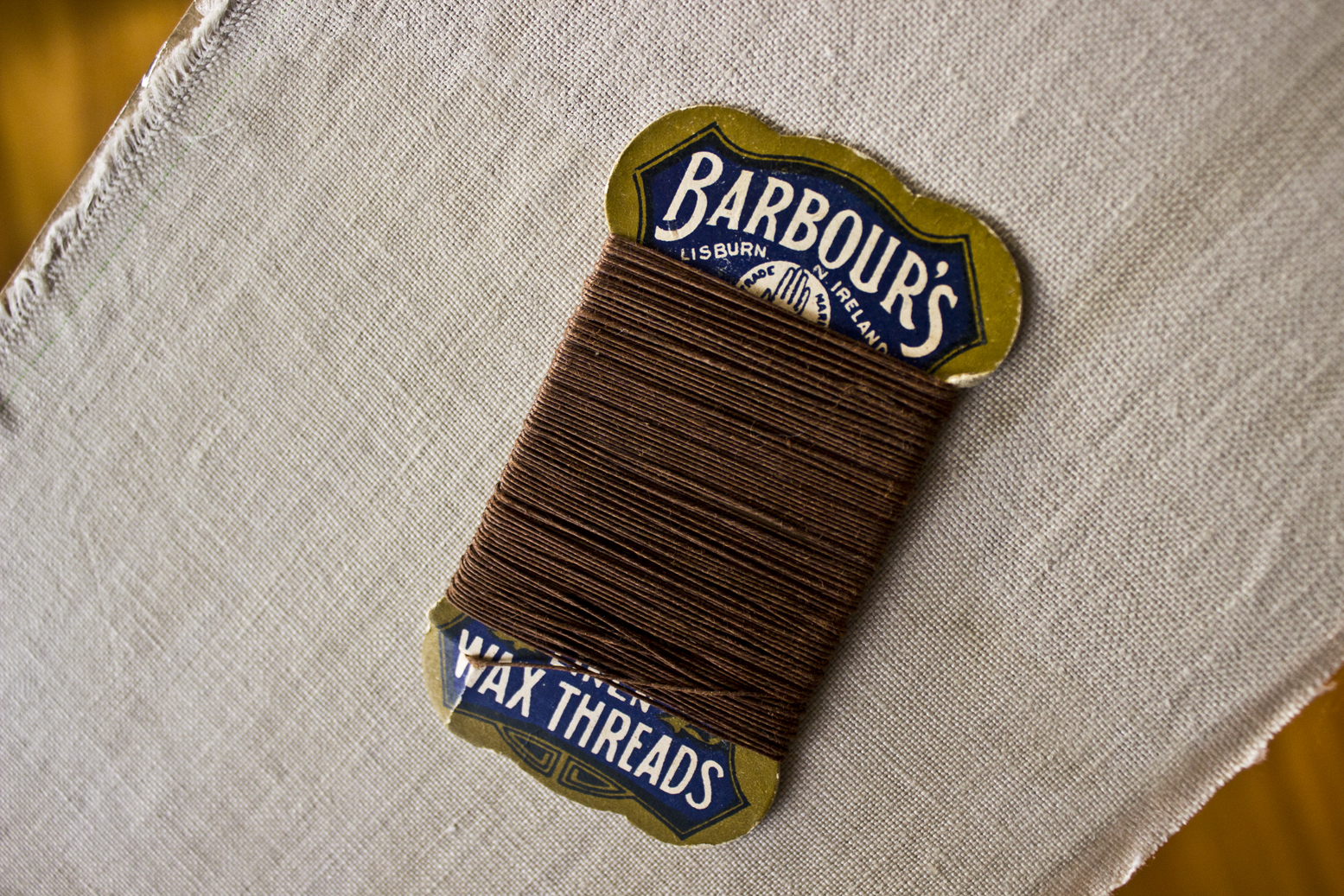
Each signature is attached to the spine of the outer cover which is covered in soft, natural linen. The brand is embroidered/hand printed onto the cover. In this instance I used waxed thread that was passed down to me by my grandmother who died in 1983 which has further elevated the object’s meaning to me.
Other functions
Pinterest images and personal images could be added.What I have learnt:
Adding importance to the image increases its importance to the user. This is how my design might change the perspective of users. In addition, it is the process that becomes important. Immersing myself in the process of crafting a safe haven for my magazine images was pleasurable and felt worthwhile.
Finally I have realised that by remediating digital images into material objects, I am reengaging with the question of the purpose of photography which lent a sense of meaning to my design.
Monday, June 1, 2015
ccdn 371 | process - found the answer
I am going to use the velum and card to make a non standard book - half way between a A3 and 4 size it comes out like this:
And then I am using thin tape to attach the velum printed with the best of my monthly reads.
I will make a cloth covered book to house the 12 (monthly) signatures. I have researched the methods used to really finish the book to a high standard.
 |
| Source |

So I purchased some of the materials and started to experiment

This was too obvious

But I like the page being attached to edge of the linen card (which I really love)

So I think there is a solution here - to use the linen card as the outer layer of the signature

And yes - here is is. The A3 linen card can be folded off-centre and the A4 printed page is attached with the narrow double-sided tape:

So now I need to fold them all:

And then cut the card cover (which will be covered in fabric)

So that the linen card signatures can be bound inside:

For all this, my bone scoring/folding tool has been indispensable - sixteen years after I bought it...

Here the cover of the signature takes shape - note that this is a proto-type and did not end up being used.

I wanted to embroider the word keep on it to retain something of my previous work. I tried multiple options like this:


Now the cloth will be glued to the card cover (with Mod Podge - I ended up having to buy the matte version when the glossy Mod Podge proved to streak too much)

Then came the binding - I had 12 signatures which were numbered so as not to mis-order them - too bad that idea didn't work. I still managed to sew them together the wrong way. Undid it and sewed it again.

Looked at all options for the thread - the red thread I bought was too thick. So I looked at organic thread, but it seemed too thin (which risks ripping the paper):

The solution was Grandma Davis' wax thread - perfect for book binding. REALLY old. I was pretty happy I could use it for this project.
I then made sure it was all square and marked where the thread would go:

Here is where the linen tape gets sewn in to the book binding:

The tutorial where I found out how to bind a book is here.
Here you can see where I have attached the mull cloth to the spine (with a tonne of tacky glue):

Here I am trying out options for the inner paper to line cover and disguise where the glued bits are:
 |
| Green |
 |
| Black |

Subscribe to:
Posts (Atom)