My photo
Sydney, Australia
portfolio | precedents | process [since 2012]

Labels

Showing posts with label DSDN 101. Show all posts

Tuesday, June 25, 2013

dsdn 101 | project 3 caritas clip - hand-in

My Caritas video as per our project three brief:


After starting with a very different vision, where I planned on using characters based on the drawings of my three year old daughter to animate my clip, I decided to simplify things. After our initial presentation 
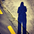
before study break, I decided to use photography combined with illustrations so that it had the same feeling but incorporated a real human into my story.

I actually dreamed about this clip a couple of weeks ago, a hand rubbing each drawing out as the viewer is shown the options available to participants in the Caritas Challenge. I got out of bed and ran to my desk to put the white board on top of my keyboard so I would remember the idea in the morning. This is exactly what my dream looked like, so I am pleased from that perspective.

I really wanted to focus on how the challenge offers a variety of choices as stated in my initial brief. (here). I am satisfied with the level of success I've had in this regard.

Software stuff:

I downloaded a really great application called DSLRemote  that allowed me to shoot all my images (I imported a total of 777 JPEGs into Premiere Pro for the editing phase) at regular intervals and remotely (from the PC) without jerking the camera. Thus I had a high level of control over the smoothness of the finished product. It was a trial download but even at 175 USD it made me want to buy it due to its ease of use and the superior results.

I really got to grips with Adobe Photoshop during this project. I have a much better understanding of how the layers work and now have a huge amount of keyboard shortcuts committed to memory - (hopefully, for a while). It's such a versatile programme and I loved the simple animation tools Elle showed me - this helped visualise my scenes quickly as I worked.

I was a little intimidated by the seriousness of the Adobe Premiere Pro workspace when I first opened it up. It looks like it's really complicated but actually it's not that bad. I owe a big thanks to the Youtube tutors who basically taught me Pr in half a day.

Contributors & acknowledgements:

On that note, a big shout out to my music guy Luke Williams who is eleven. He composed AND played the 60 second piece you can hear playing during the clip. It works perfectly with the imagery and I was really lucky to have him contribute to my project. Same to my budding artist Rory who is prolific in her design and art production. I REALLY want to make a story out of her characters now that I have all this animation knowledge. Double thumbs up to G who is the ultimate gaffa/grip/best boy and PC fixer dude. He's also a pretty awesome husband.

Oh and finally one last thanks to my three 101 tutors, Brooke, Dana and Eli who each gave generously of their time and experience this trimester and helped inspired me with my work. I seriously loved this paper.

Overall, even though I can always see things I could improve in my final hand-ins, I am really happy with this clip. I'll wrap this up before this starts reading like an awards acceptance speech.

Here it is...enjoy:

©2013 helenkwilliams

Monday, June 3, 2013

dsdn 101 | project 3 developing work - hand-in

I spent the best part of the weekend trying to get to the point where I could upload my work but realised today I could get a lot more out of presenting a more complete draft done in Flash.

So I more or less got the story out within a 48 second time-frame (with a couple more minor scenes to go) and in fact this was an excellent excercise in terms of understanding how the story will play out.

I have two options for sound - both composed by family members, one on acoustic guitar and the other on piano. There will also be additional sounds added to the clip where appropriate. I did not add any audio to my submitted clip.

I used all the art work except one image from my file of R's characters and saw how they will work as I progress with After Effects and Premiere. I am keen to receive feedback too.

Here is the clip:


The message at the end reads as follows: This is not my stop motion animation.... Because I am still assembling my frames for my SMA I have put together a quick Flash version using the artwork I will use in my final submission – it has been a useful exercise as it has allowed me to work out my timings more accurately. It also helped me to understand the overall feeling of the clip – what is funny and what is boring. The clip finishes at 48 seconds at the moment so I have 12 seconds to complete the clip. Which should be perfect. Thank you for watching...

Wednesday, May 29, 2013

dsdn 101 | 48 hour challenge - update

I have been working on the Illustrator file for our 48 hour project because I have decided to use the logo for my clip. While reviewing the submission I have decided I would like to change the word 'create' to 'make' because I think it is a better fit for the overall message which is simple and direct. It will also work better with my animation.

My review has led me to think through ways of improving it.
So, in the same way that I would accept feedback from a client in a commercial setting and use it to produce a better proposal, I have taken the advice and information I've received since we submitted on the 16th of May and used it to put together an improved proposal.

Therefore, if I could, I would:

  • resubmit the logo on a car that better matches the intentions of the client. If Caritas aims to make the world a better place then what better car to carry their logo than the Prius.

Logo on Prius

  • change the wording of the slogan to 'build make unplug play':


NB I may also slightly change the look and feel of our logo as I work on the animation but overall I think the child friendly colours and font of the present logo are a good match for my planned animation.

Tuesday, May 28, 2013

dsdn 101 | critique hand-in


DSDN 101 | Project Three

Critique of Keith Thurlow’s work so far 

By Helen Williams

Review of:

The 200-300 words
This is a concise plan of action – because I have talked it over with you I probably know a few more details than you are giving away here but as an introductory proposal it reads fairly well and is therefore easy to judge from a client’s point of view. Maybe a few more scraps of information (for example you might want to give a hint about the audio you’ll be using) would round it off and give you the 200 word count.
I have also made a couple of grammatical and spelling adjustments and reworded the sentences that just needed a slight change in word order – I couldn’t help myself - I hope you don’t mind.

The storyboard
My first reaction was that I really like the colours and the hand-drawn squares – it lends itself well to your plan to keep the animation basic. I was curious to know if there was a hidden message behind the colour placement but maybe I am trying to read too much into it. I was also wondering about images 21 – 23... is the idea that the stick images will form the cross logo? Maybe some explanatory notes would be helpful.

The Snapshot
I really, really like the angle and focus of this clip. And you’re right about the frame rate you want to work in if this test is anything to go by. 20 fps was too quick - 10 fps would nail it.
 

Original Proposal
 
For this Project, my intention is to raise awareness about Caritas. Specifically the Caritas Challenge; an event targeted at New Zealand school age students. This challenge offers four different options that are designed to help those involved develop an empathy for the conditions of the less fortunate in the Pacific Region.

To achieve this I will be creating a video that compares the conditions of the target audience, to the less fortunate in an entertaining and simple manner. This video will be comprised of a basic animation that switches between two people, displaying their daily actions and tasks in an abstracted, yet readable manner.

I intend to develop empathy and a feeling of responsibility within this target audience.. Because the aim of the video is to attract interest, I will not explicitly describe each of the four challenges and instead entice the viewer to visit the Challenge website to find out more.  I intend to create simple abstracted drawings in illustrator and animate them in flash at a slow frame rate, 8-12fps. The final clip will be approximately 60 seconds long.


Rewritten Proposal

For this Project, my intention is to raise awareness about Caritas. Specifically the Caritas Challenge; an event targeted at New Zealand school age students. This challenge offers four different options that are designed to help those involved develop empathy for the conditions of the less fortunate in the Pacific Region.

 To achieve this I will be creating a video that compares the conditions of the target audience, to the less fortunate in an entertaining and simple manner. This video will be comprised of a basic animation that switches between two people, displaying their daily actions and tasks in an abstracted, yet readable manner.

 I intend to develop empathy and a feeling of responsibility within this target audience. Because the aim of the video is to attract interest, I will not explicitly describe each of the four challenges and instead entice the viewer to visit the Challenge website to find out more. (Note 1) I intend to create simple abstracted drawings in illustrator and animate them in flash at a slow frame rate, 8-12fps. The final clip will be approximately 60 seconds long.


Note 1: I thought the sentence commencing 'I do not intend...' could be stated in a more positive way – clients might read the original as a little negative.


dsdn 101 | inspiration

This stop motion animation is really inspiring it almost made me want to drop everything and make my clip completely differently... really amazing.


The story of its making:

Monday, May 27, 2013

dsdn 101 | storyboard hand-in


My storyboard thus far for project three..


I have presented my storyboard as a book for several reasons. Firstly I wanted to remain true to the theme of child's play that is crucial to my animation’s message. Sixteen pages long, it presents the story in the style of a young child’s colouring or activity book while still giving the client the key information such as frame-by-frame action and technical information which can be found on the last page. I also wanted to create a point of difference for my hand-in without sacrificing ease of use.
Views of handed in storyboard/colouring book


Here it is frame by frame...


Friday, May 24, 2013

dsdn 101 | inspiration

A little inspiration - I love the work of Kirsten LePore who is an artist and filmmaker who works with different animation techniques, including stop-motion animation and claymation.

Here is her stop motion film 'Bottle' which is the most lovely, bitter-sweet story of an unexpected connection between sand and snow you are ever likely to see. Her sense of whimsy is exactly what I would like to express in my own animation...


Bottle from Kirsten Lepore on Vimeo.

Tuesday, May 21, 2013

dsdn 101 | test stop motion animation hand-in


I have hand-drawn 50 frames of a sequence using a drawing (of a mermaid) by my daughter as my jumping-off point. This is the type of animation style I would like to use for project three.


The film @5fps looks the best but the required 10 fps and 20 fps files can be seen here and here

I think the style works really well and will be useful in communicating my ideas so I will be using illustrations inspired by the drawings of my three year old daughter.


A small unicorn (and the sun) ©2013 R Williams


Mermaids ©2013 R Williams


Pony ©2013 R Williams

Dolphin ©2013 R Williams
More characters ©2013 R Williams


Monday, May 20, 2013

dsdn 101 | project 3 - design intentions


Project three:  design intentions for the Caritas Challenge

In this project I will create an inspiring visual message for Caritas that will represent the organisation’s ideals and aims for the Caritas Challenge taking place in April 2014.  

The outcome of the project will be a 40 - 60 second stop motion animation that will promote and encourage participation in the event to children within the eleven to eighteen year old demographic.

Through my research I will gain a clear understanding of the cultural issues and perceptions that apply to the client’s place in the local and international community. Using a strong but simple narrative I will use the resulting information to explain who my client is and what their aims are in organising the Caritas Challenge.

I will promote each of the four options as a unique opportunity to inspire children to challenge themselves. I will achieve this through themes of imagination and role-play. I will demonstrate to the target audience that they will not only take part in an enjoyable and rewarding activity but also experience solidarity with both their peers and with those enduring poverty throughout the world.  

I will research precedents of stop motion animation and use my findings to apply fresh approaches to the medium. I will use the 40 – 60 second time-frame to send a succinct message about the Challenge and its aims.  


Thursday, May 16, 2013

dsdn 101 | 48 hour challenge - hand-in

Slogan:

for the Caritas Challenge that encourages participation and demonstrates the aims and ideals of the challenge

t-shirt - slogan

Logo:


suitable for letterhead, business cards and application to a vehicle
t-shirt - logo


car


Team:


Our group is: Vijay Ranchhod; Peter Setterfield; Neal Redward and me - Helen Williams.


Wednesday, May 15, 2013

dsdn 101 | 48 hour challenge - process work

The Caritas Challenge


We've been put into groups of 3 - 4 students to put together a logo and slogan for the first part of project 3. 
For this first part we are required to produce a logo suitable for letterhead, business cards and application to a vehicle.

We will also need to devise a slogan for the Caritas Challenge that encourages participation and demonstrates the aims and ideals of the challenge.

The client is Caritas NZ.

The audience demographic is kids from intermediate, secondary schools and youth groups, so 11 to 19 year olds, male and female.

At our initial group meeting we exchanged names and details. Our group is: Vijay Ranchhod; Peter Setterfield; Neal Redward and me.

Initially Peter worked on Illustrator while we sketched ideas and came up with slogan options.

We settled on using four simple words and/or symbols that each encapsulated the four options of the Caritas Challenge. To do this we brainstormed, coming up with multiple words and symbols for each challenge:


Slum Challenge: cardboard; newspaper; shelter, building; patchwork; corrugated iron

Sweatshop Challenge: handmade, sewing machines; dark rooms; industrial

Give it up Challenge: social networking; technology; fast food; Edmonds Baking Powder


Mighty Ks Challenge: Feet; tramping; cycle; swimming

We tried using sloganmaker.com (a slogan generating app) to come up with ideas too:

Solidarity for a better future

Feel the spirit of solidarity etc

Eventually we decided we wanted to stick to the single word idea since it seems more contemporary and youthful. (Someone told me today they thought our slogan sounded 'apple-y')

First idea was: build. create. deactivate. play.

We also thought of: build. create. participate. play.

And: build. create. reconnect. play. 

Present Caritas NZ logo


We then talked about what elements we wanted to include/exclude in the new logo. We thought the cross might be important put we wanted to do it in a fresher way. We also weren't sure about how the koru was represented in the original logo and wondered about how might incorporate it in a better way. The brown they have adopted as their corporate colour was also used in our first attempts to emphasis commonality. 

We then tried to use some of the elements from the Caritas NZ logo as a starting point for putting together a logo specific to the Caritas Challenge.

We wanted to use 'fun' colours which might subconsciously attract the attention of the target audience.

We also talked about how it is a time-based challenge (takes place over 24 hours) so talked about incorporating a clock into the logo.

On Wednesday we gathered together what we already had including some awesome logos from Neal and Peter and then as a group (with both Pater and Neal on Illustrator) we tried to finalise our decisions about which logo worked best, taking the elements we liked best from all the work to put together a final logo.

I went out and asked a variety of people around the building about our slogan choice to try and gauge which was the most successful version. We have unanimously agreed to use the one we'll present.

Here are examples of our process work:

Neal

Neal

Vijay
 
Peter

  
Peter's added more here: peter-set-dsdn


Neal - process